


Design and Tech

TOT

Website

Branding

Development

Where Little Minds Begin Big Journeys

hero banner

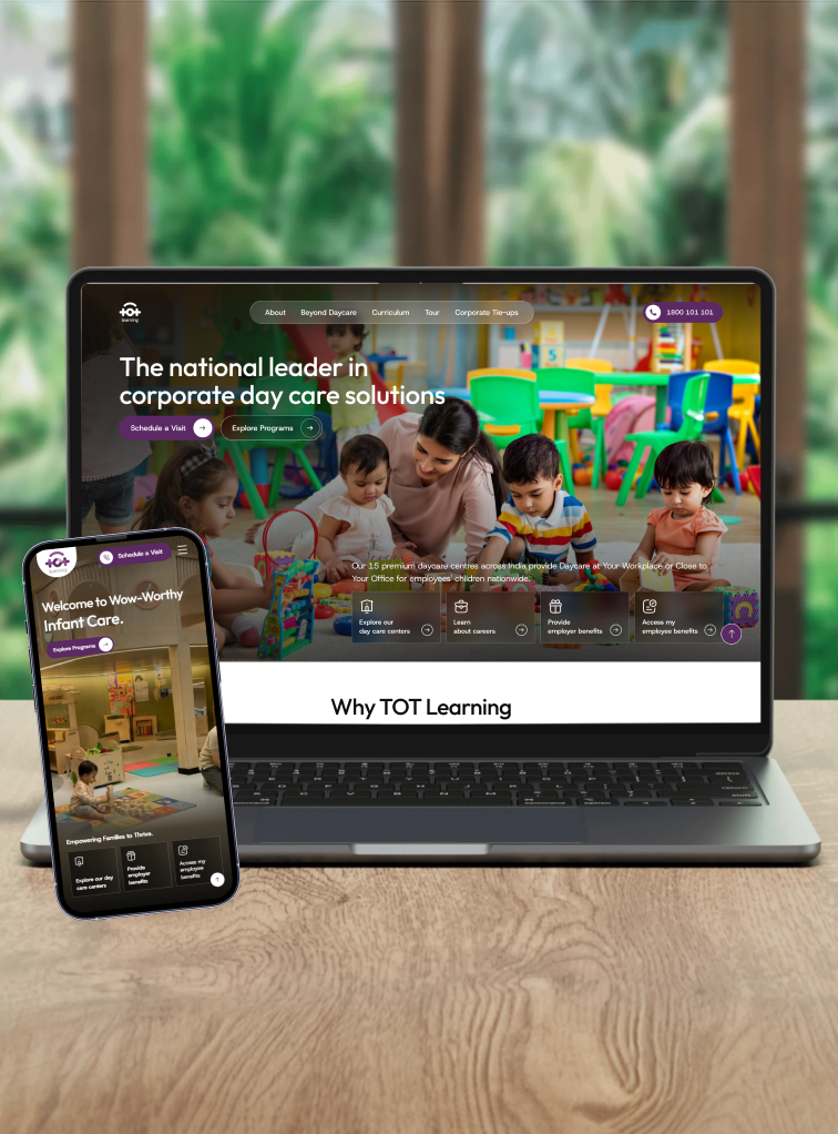
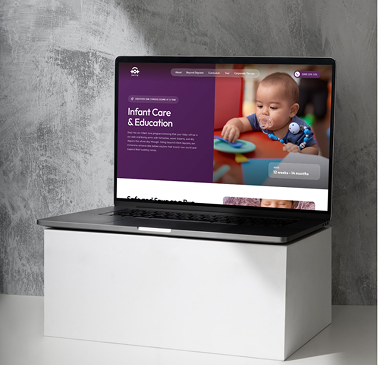
Reimagined TOT Learning’s online presence through thoughtful UX, modern UI, and emotionally resonant storytelling to build trust and drive meaningful parent engagement.

Our Team

Head of Design
Siddharth Bajpai
Brand Designer
Amit Singhania
UI Designer
Shivam Tiwari
Web Developer
Shivam Tiwari
Web Developer
Chinmay Zope

The Problem Statement

TOT Learning occupies a unique position in the market. Unlike traditional preschools or neighborhood daycare centers, the organization operates at the intersection of childcare, education, employee wellbeing, and workplace infrastructure. Its audience ranges from HR leaders and corporate decision-makers to working parents seeking reassurance and trust.
The challenge was creating a brand that could simultaneously communicate professionalism to enterprise clients and warmth to parents — structured without appearing institutional, caring without appearing childish, and premium without becoming inaccessible.
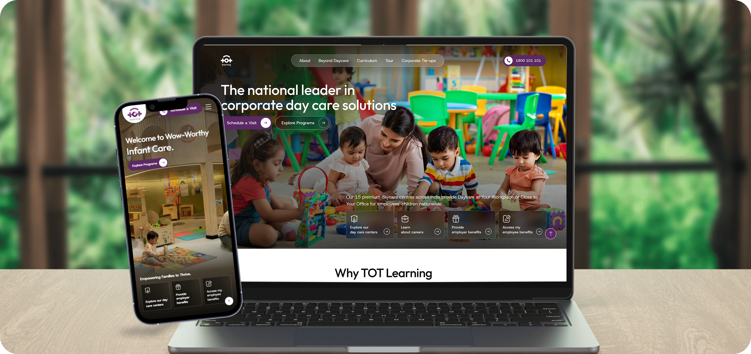
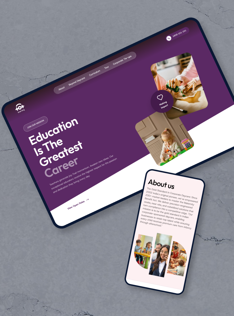
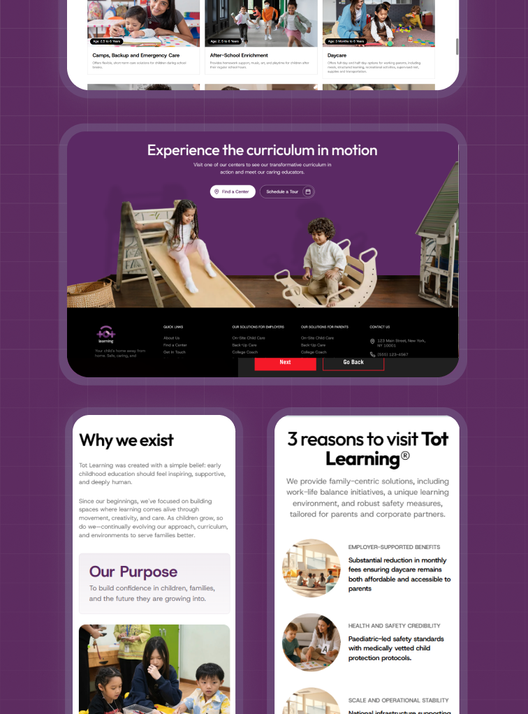
TOT Learning website mockup alongside iPhone showing the mobile experience

The Challenge

TOT Learning occupies a unique position in the market. Unlike traditional preschools or neighborhood daycare centers, the organization operates at the intersection of childcare, education, employee wellbeing, and workplace infrastructure. Its audience ranges from HR leaders and corporate decision-makers to working parents seeking reassurance and trust.
The challenge was creating a brand that could simultaneously communicate professionalism to enterprise clients and warmth to parents — structured without appearing institutional, caring without appearing childish, and premium without becoming inaccessible.
TOT Learning schedule-a-visit interface showing center visit booking

Discovering the brand.

Through stakeholder workshops, business discovery sessions, and brand exploration exercises, we uncovered a powerful narrative rooted in trust, responsibility, and care.
What emerged was a simple but powerful insight. Parents are not searching for daycare. They are searching for peace of mind. Organizations are not simply purchasing childcare services. They are investing in employee wellbeing, retention, productivity, and workplace inclusion.
Brand discovery workshop imagery and exploration visuals

Defining a new identity.

The new identity needed to move beyond traditional childcare visual language while retaining the warmth that families associate with care and learning.
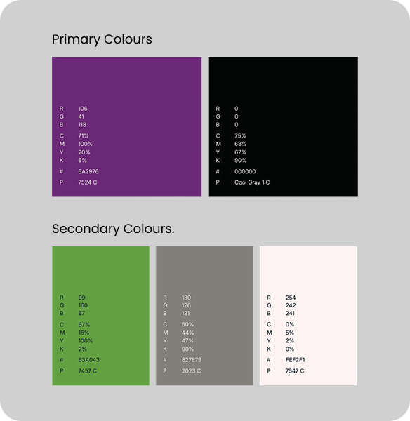
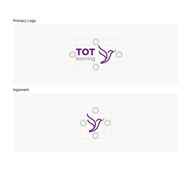
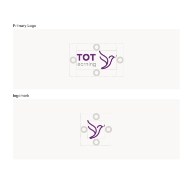
The resulting system was designed around growth, freedom, nurturing, and trust anchored by a distinctive bird-inspired mark that symbolizes care, aspiration, protection, and development. A refined colour palette and typography hierarchy balance professionalism with accessibility.
TOT Learning brand identity — primary colours, secondary colours, and logo mark

Bringing the brand to life.

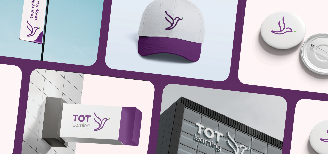
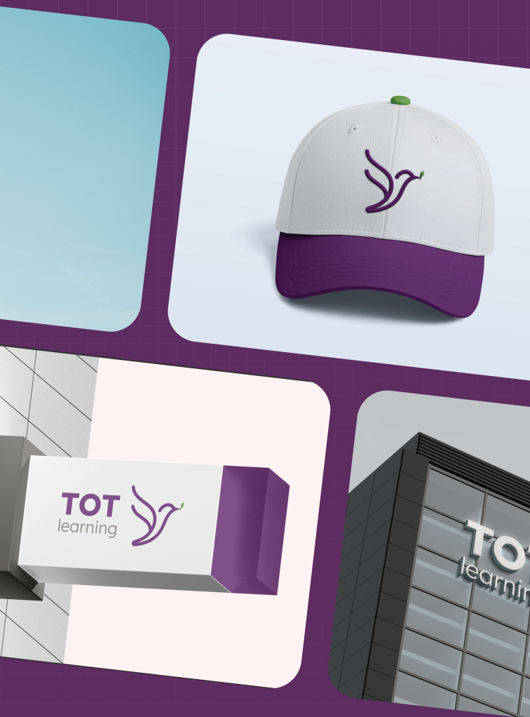
Beyond the logo, we developed a comprehensive identity system designed to scale across every interaction — signage and stationery, merchandise, digital communications, presentations, and workplace environments.
The new identity transformed TOT Learning from a childcare provider into a recognizable and scalable brand platform ready for future expansion.
TOT Learning brand applications across signage, stationery, merchandise, and digital communications

Optimized for Every Screen

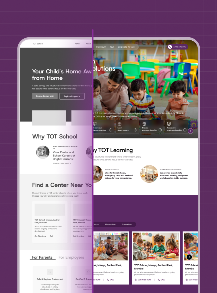
Recognizing the diversity of devices used for property searches, our design focused on a responsive approach. Regardless of the device, users can expect a seamless and engaging experience.
Our commitment to accessibility and usability shines through as we break down the challenges and triumphs of crafting an app that adapts fluidly to diverse user contexts.
TOT Learning responsive design showcased across desktop, tablet, and mobile devices

Technology Used

The final website was developed in Framer as a high-performance, scalable platform capable of supporting TOT Learning’s future growth. The architecture was designed around key conversion journeys — parent inquiries, corporate partnership discussions, center discovery, and brand exploration.
Flexible content structures and CMS-driven sections ensured the team could continue evolving the platform as the organization expands into new regions and partnerships.
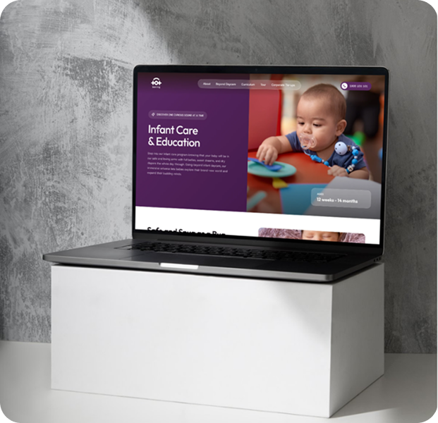
Technology stack — Figma and Framer logos with website mockup

Our Solution

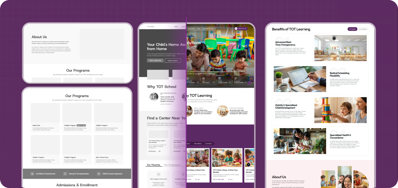
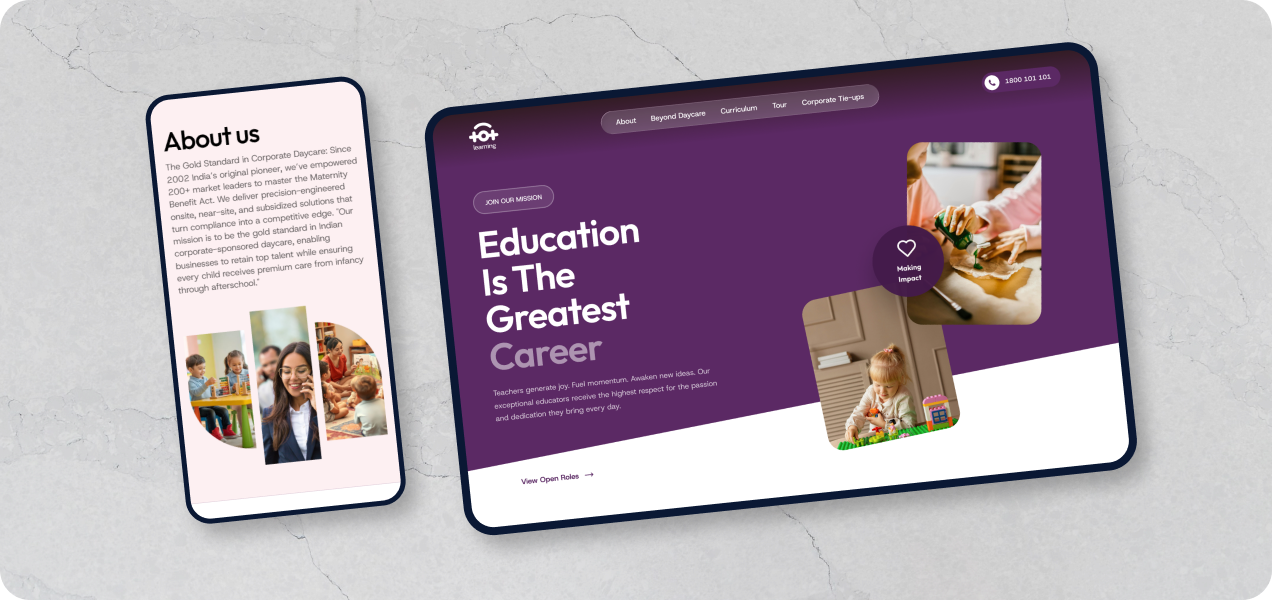
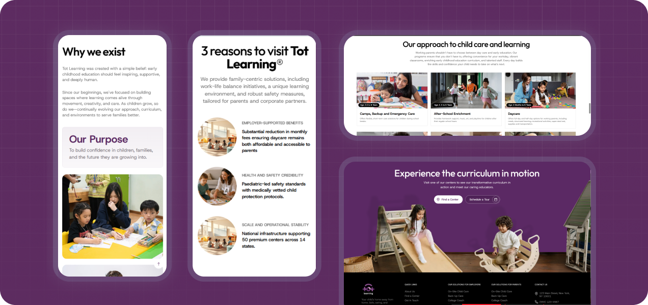
The transformation of TOT Learning extended far beyond aesthetics. A legacy childcare organization was reintroduced to the market with a renewed sense of purpose, clarity, and confidence. The new identity captures the balance between care and professionalism that defines the organization. The website translates that positioning into an intuitive digital experience designed to build trust, answer questions, and support growth.
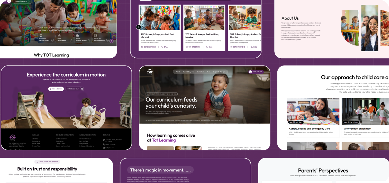
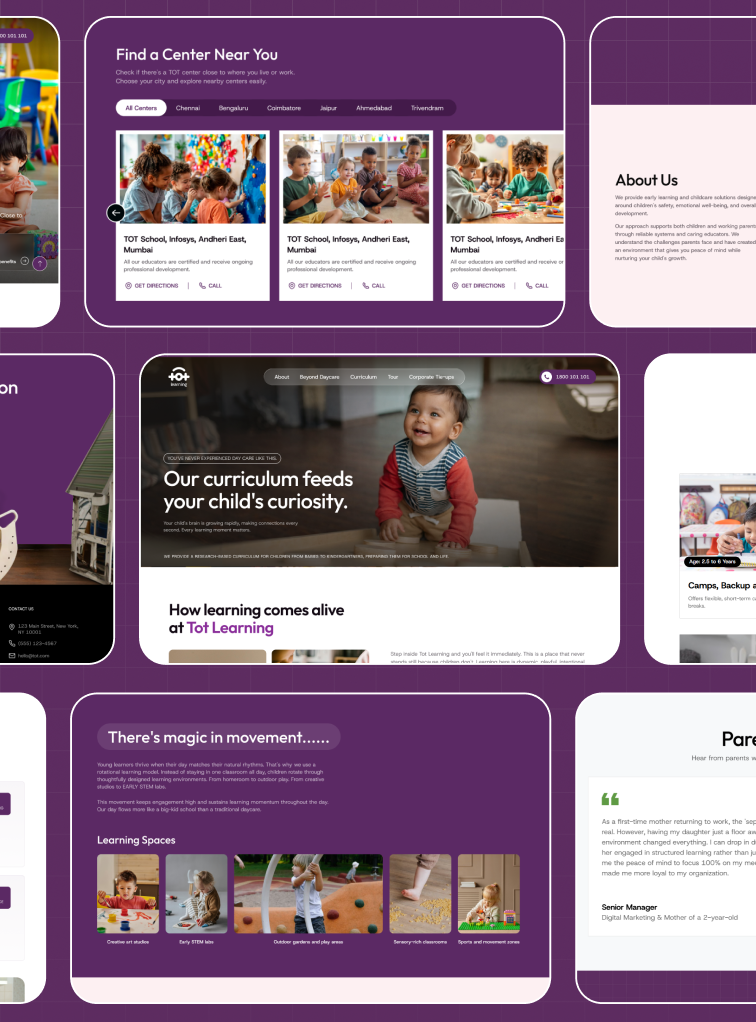
TOT Learning final website design across desktop and mobile mockups

Conclusion

The TOT Learning website successfully redefined the brand’s digital presence through a balance of emotional storytelling, modern design systems, and intuitive user experiences. By combining clarity with warmth, the platform now creates a stronger connection with parents while delivering a seamless and engaging browsing experience across every touchpoint.

Idea to impact : Our work

Home

Mumbai City FC

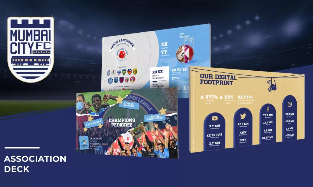
New brand identity for one of Asia's most successful football teams!

Home

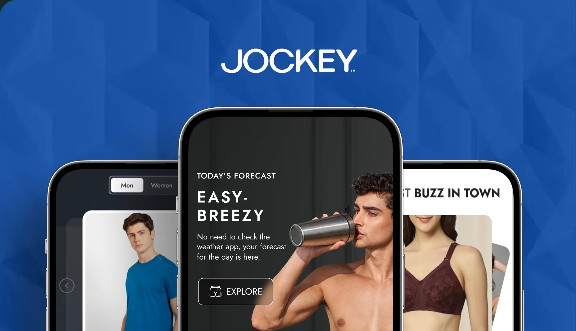
Jockey

40% increase in sales! — Delivered a seamless UI/UX redesign for Jockey India’s digital experience.

Home

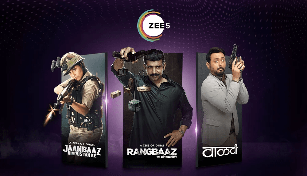
Zee5

Unlocked regional reach—built multi-language creatives for India-wide engagement on Zee5.

Home

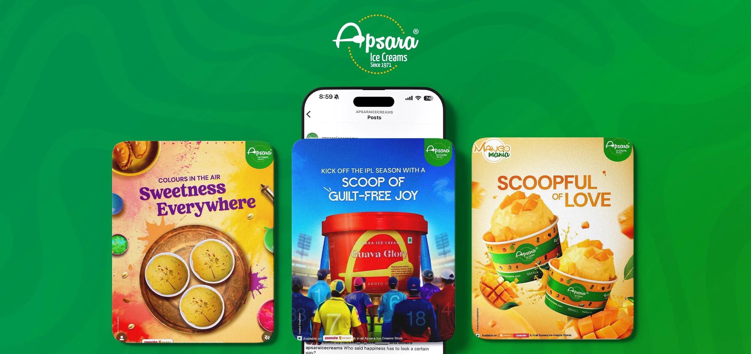
Apsara Ice Creams

Elevated Apsara’s brand experience with craveable, flavour-first design—turning every scroll into a sensory summer moment.

Home

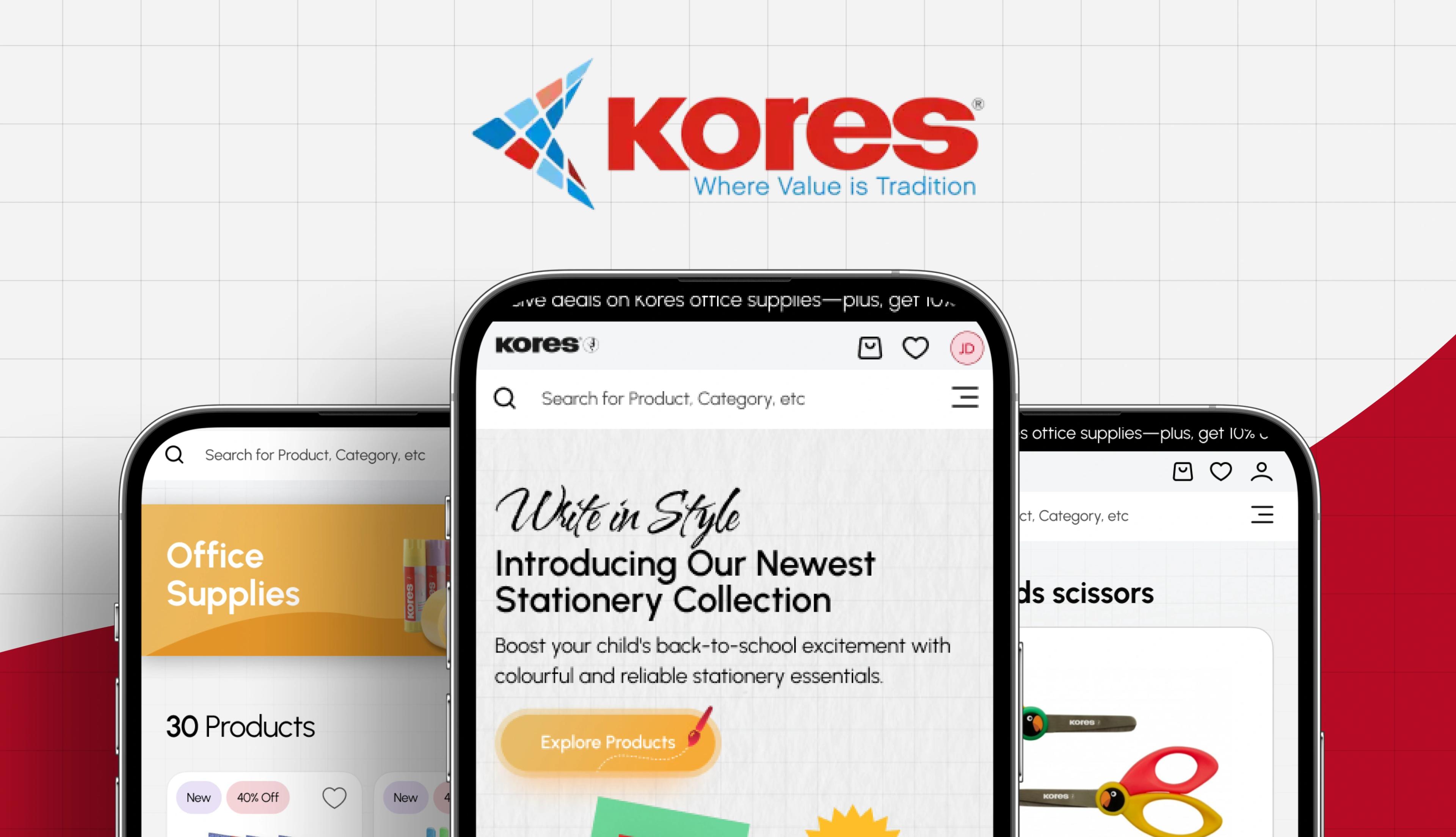
Kores India

Crafting a seamless online store for an iconic stationery brand.

Home

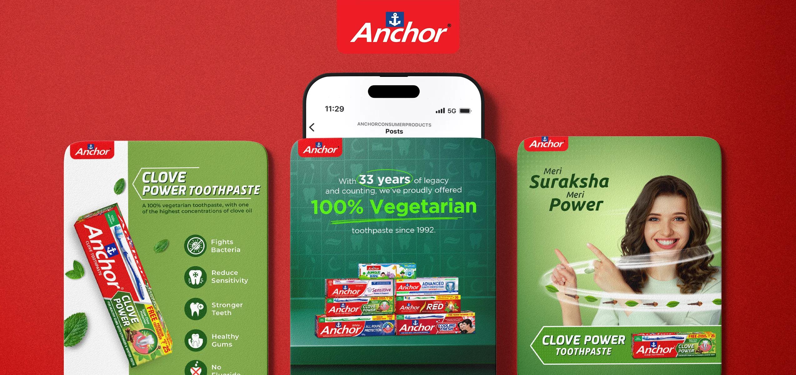
Anchor

Repositioned a legacy toothpaste brand with fresh messaging and trend-led content—reviving trust and boosting relevance in a hyper-competitive oral care market.

Home

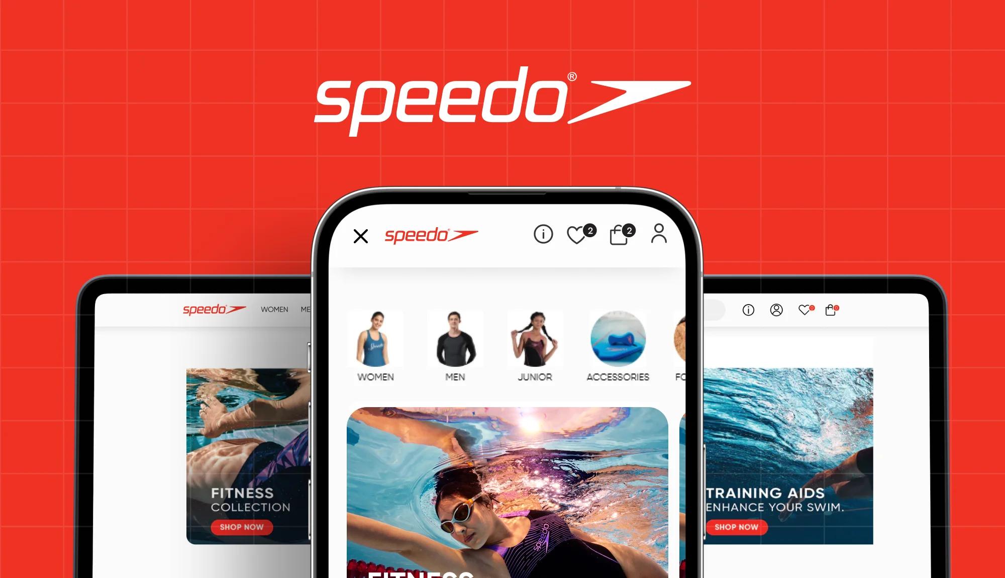
Speedo

Designing a seamless swimwear
shopping experience