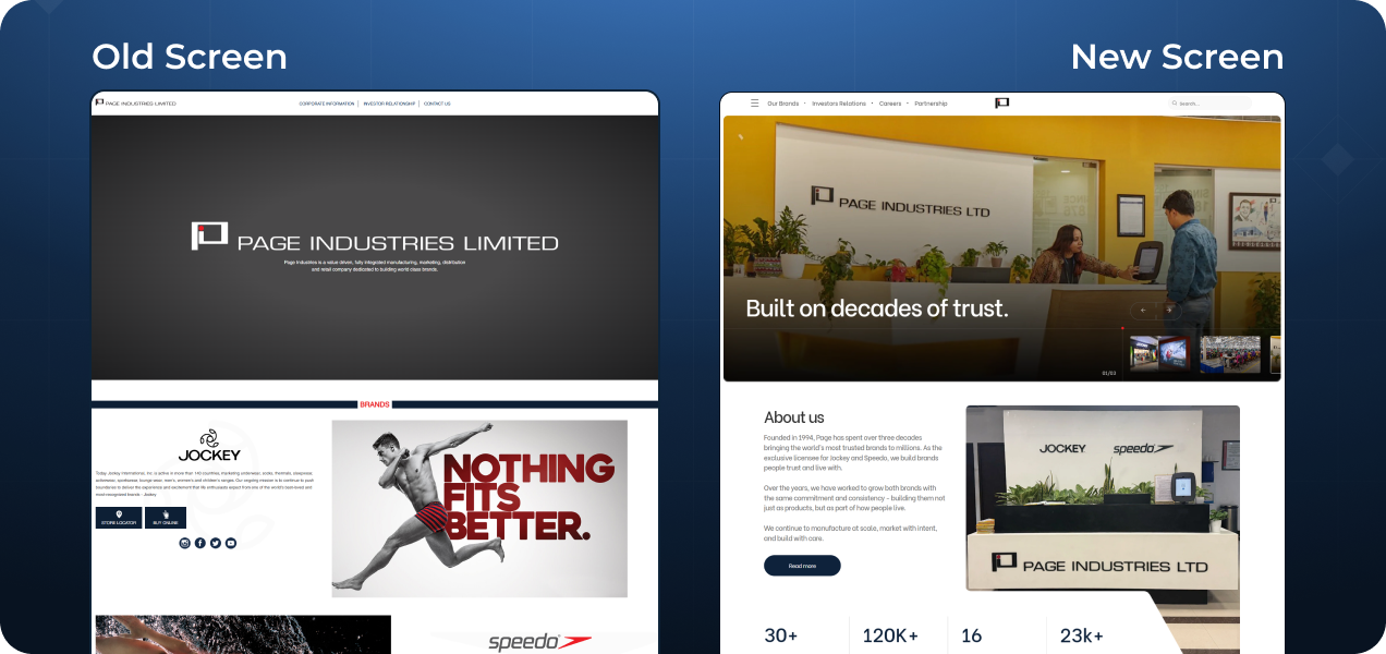




“We reshaped Page Industries' digital presence to reflect the scale, values, leadership, and global ambition of a modern corporate brand.”
Our Team
Head of Design
Siddharth Bajpai
Account Manager
Vaishnavi Isal
UX Designer
Saakshi Kumber
UI Designer
Ashwin Pradeep
UI Designer
Darshak Jadhav
UI Designer
Pranay Sawant
The Problem Statement
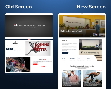
Page Industries' old website did not reflect the stature of the company. It felt basic, scattered, and difficult to navigate. Important information was missing, pages lacked depth, and the experience failed to show how big, trusted, and established the brand truly is. The need was clear, create a website that feels premium, structured, and worthy of a corporate leader.
Our Strategy
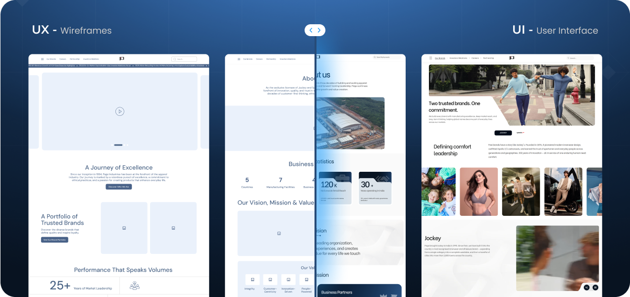
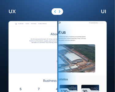
We focused on building a strong corporate identity through design. The goal was to move from a simple, complex site to a refined, premium, functional experience. We reworked the structure, added meaningful pages, and shaped a journey that clearly tells Page's story its values, scale, and vision. Every screen was designed to feel confident, clear, and professional.
Information Architecture & Navigation
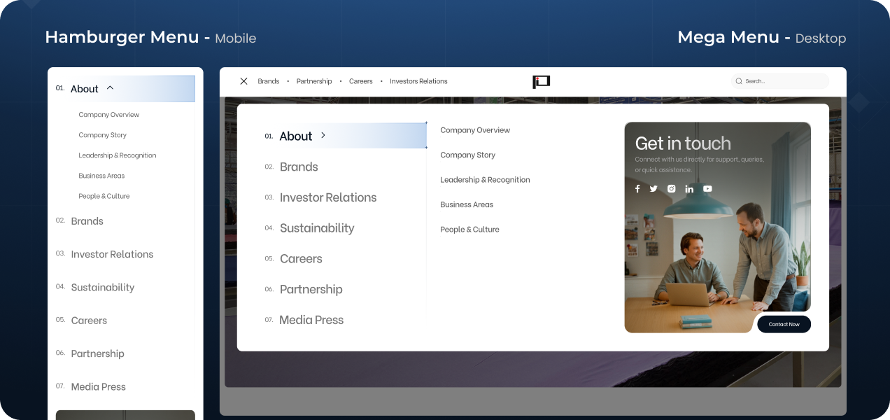
We simplified how users move through the website. Content was grouped with purpose, pages were restructured, and the flow was designed to feel natural and easy to follow. This helped users quickly understand who Page Industries is and what it stands for without feeling lost or overwhelmed. Multiple navigation tests ensured that even complex corporate information feels simple and approachable.
Optimized for Every Screen
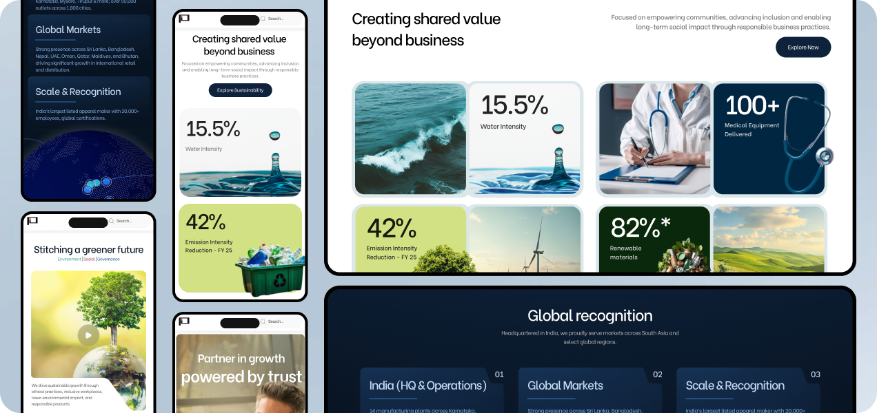
The experience was designed with mobile users in mind from the start. We ran multiple user tests to make sure navigation feels effortless on smaller screens. Content is broken into clean sections, making it easy to scan, read, and explore whether on desktop or mobile. The result is a smooth, consistent experience across all devices.
Typography & Visual Expression
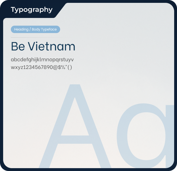
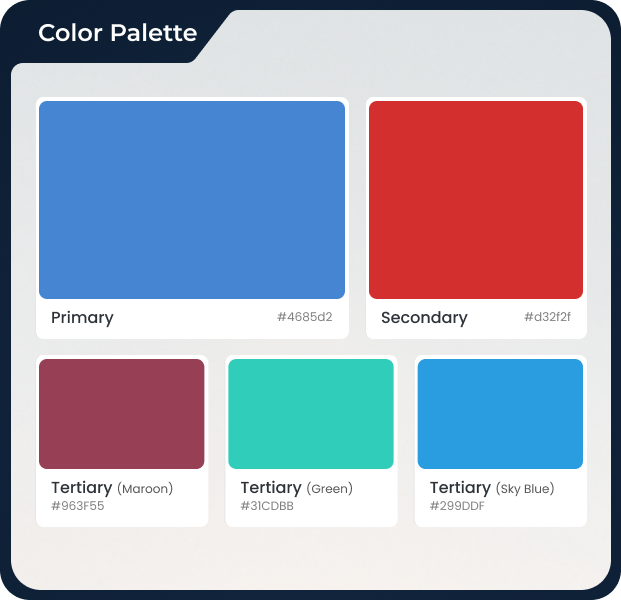
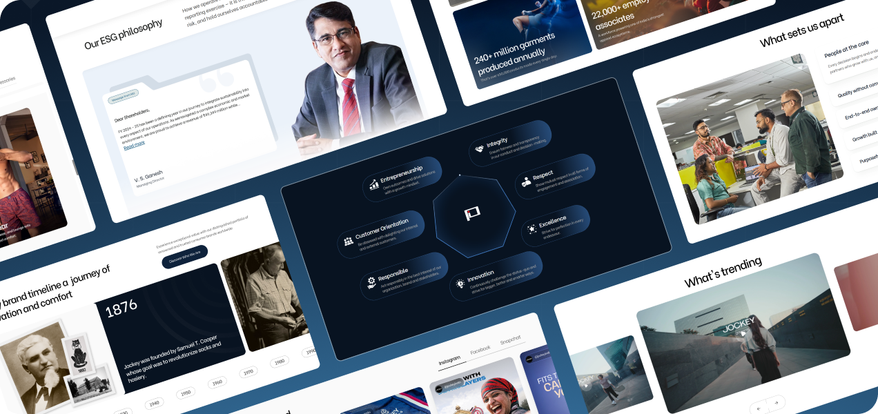
The visual style was created to feel premium and modern. Clean typography, balanced spacing, and a refined colour palette give the website a calm, confident tone. Each section has its own identity while staying part of one strong system. This helps the content breathe and keeps the experience clear, elegant, and easy to engage with.
Motion & Interaction Design
Subtle animations bring the website to life. Transitions, hovers, and micro-interactions guide attention and make navigation feel smooth and intuitive. These small details add depth and polish, creating a sense of quality without distracting from the content.
Our Solution
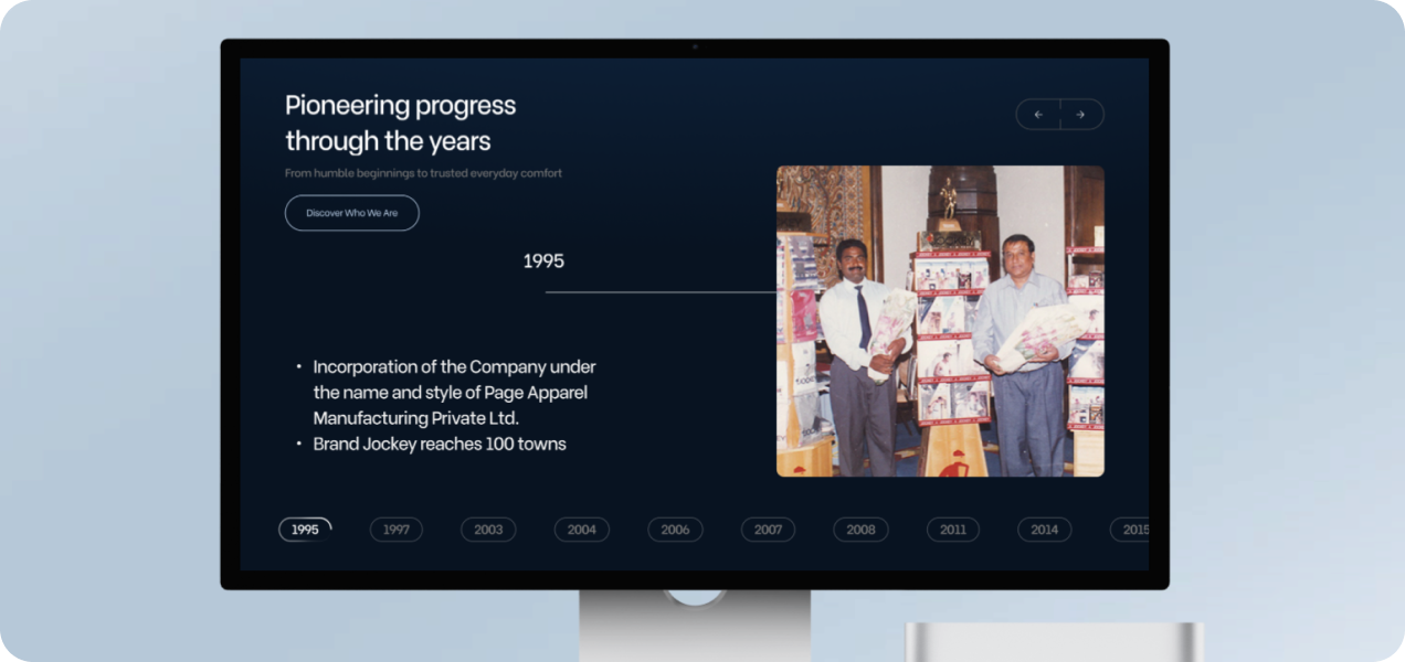
We delivered a complete design transformation for Page Industries. From structure to screens, every part of the website was reimagined. New pages, clearer flows, and a unified design system now present Page Industries as a strong corporate brand beyond just its consumer labels. The platform now communicates trust, scale, and ambition with clarity.
Conclusion
The new Page Industries website is not just better looking it tells a stronger story. It reflects a brand that balances legacy with innovation and professionalism with warmth. What was once basic and fragmented is now a premium, confident, and cohesive digital presence worthy of the organisation it represents.
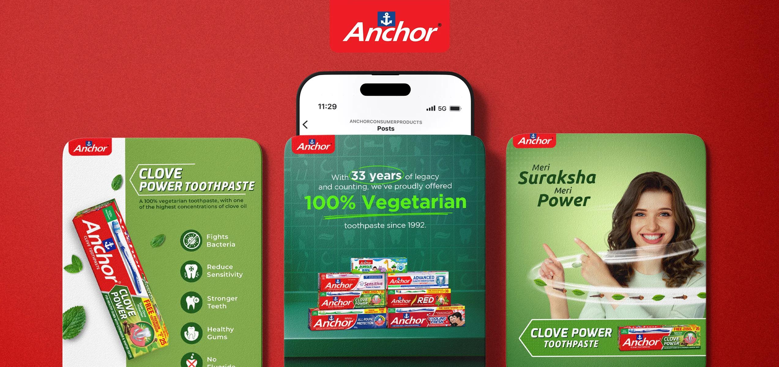
Repositioned a legacy toothpaste brand with fresh messaging and trend-led content—reviving trust and boosting relevance in a hyper-competitive oral care market.