
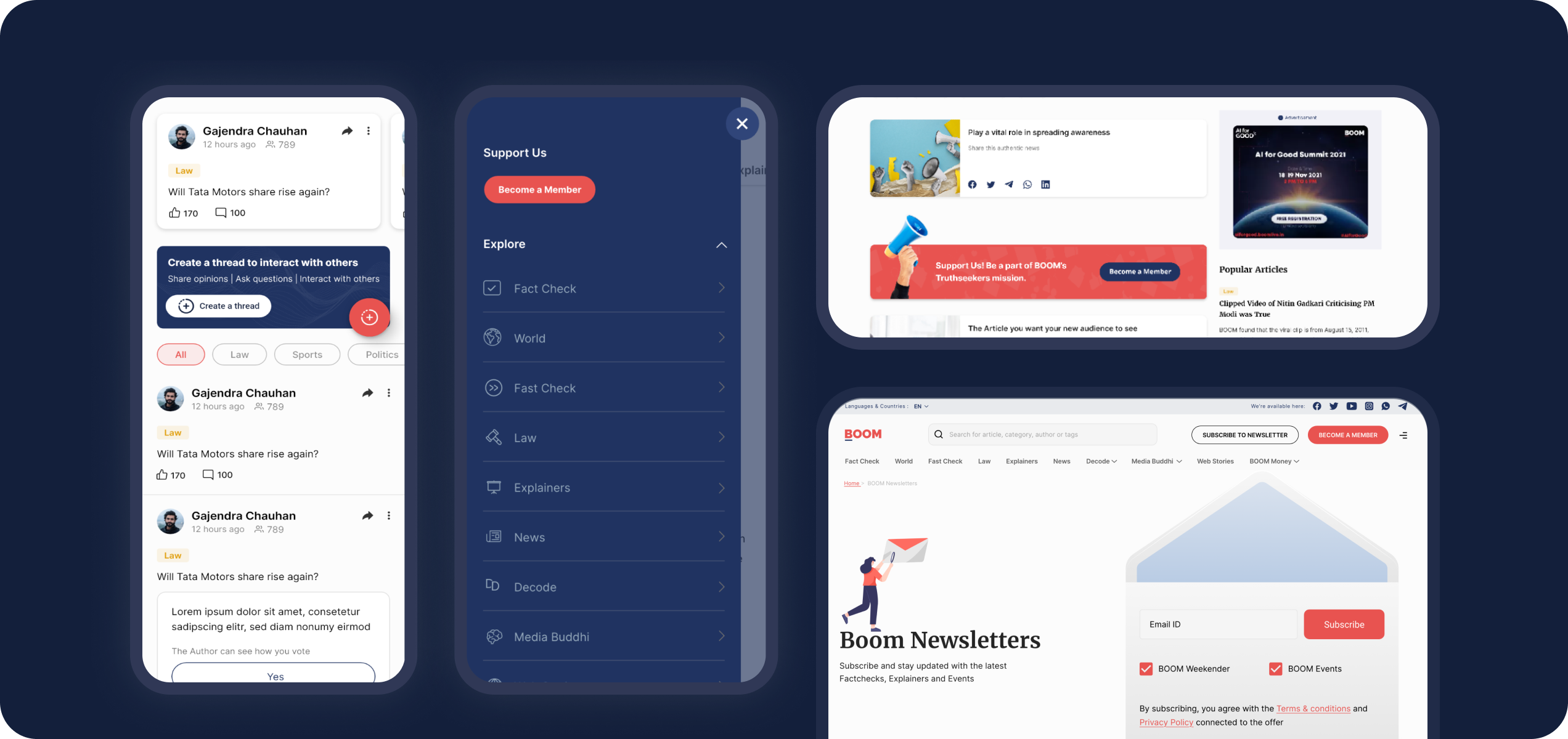
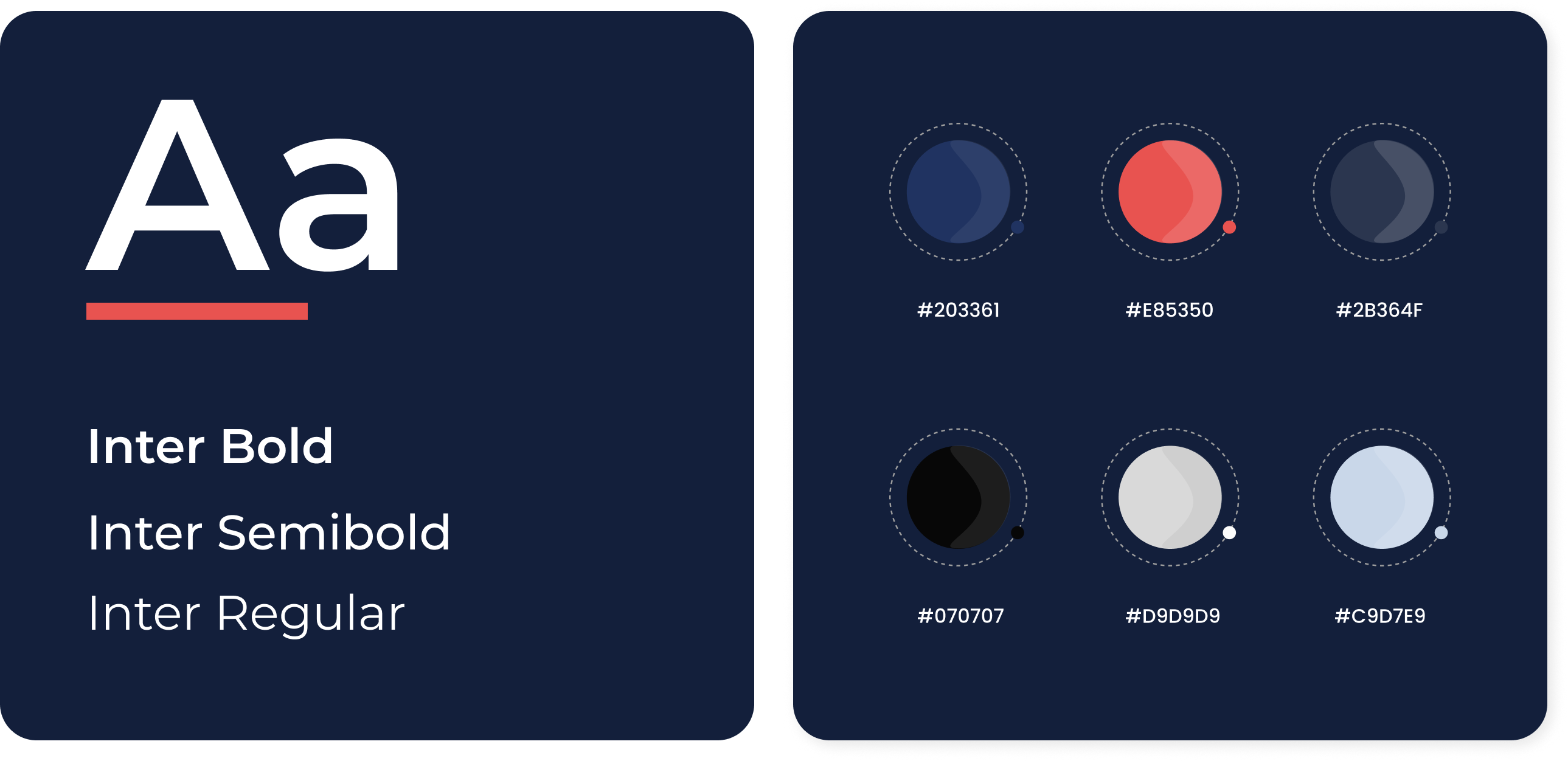
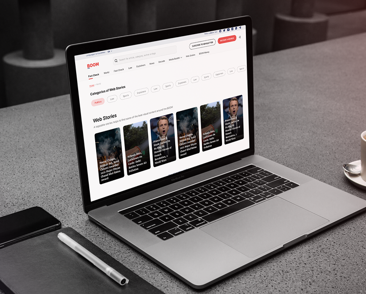
Your UX/UI partner

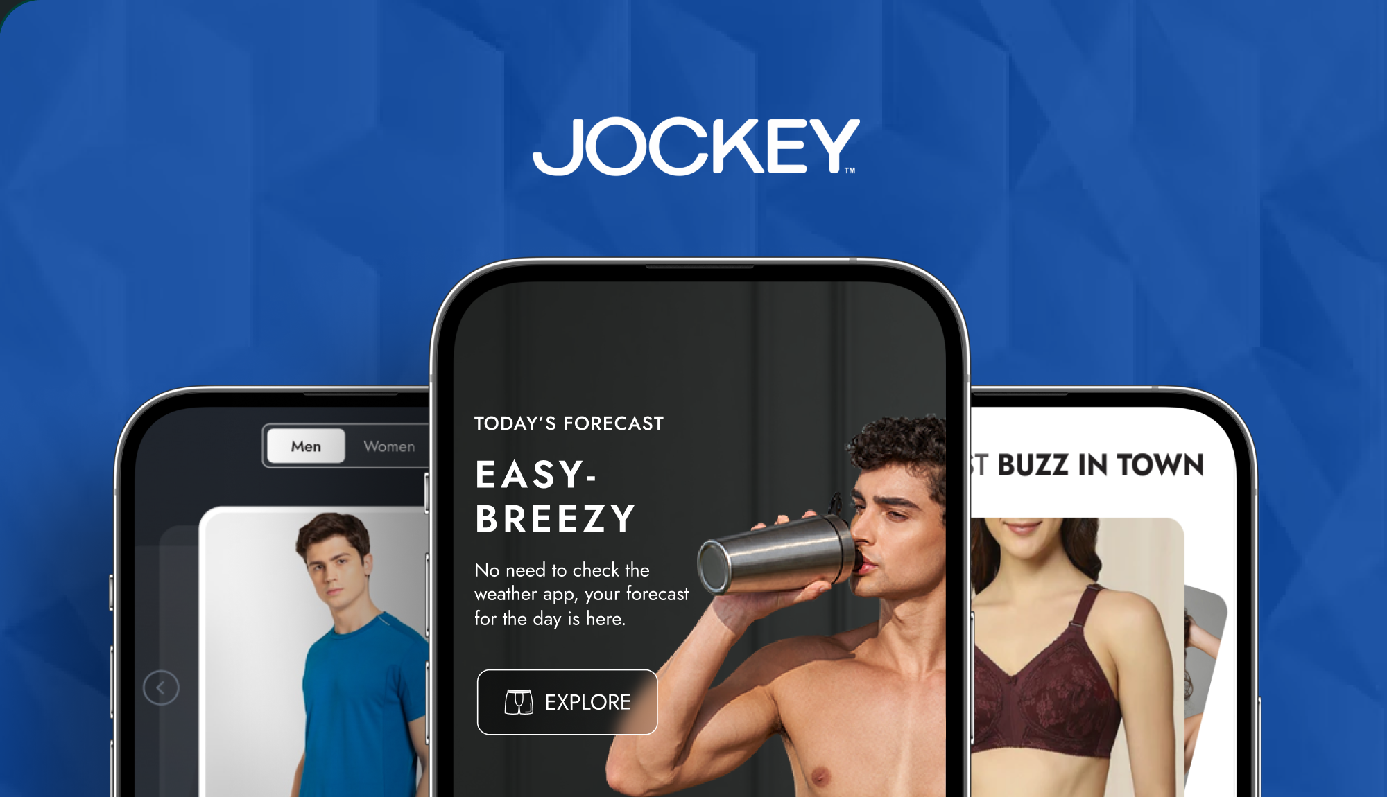
Your Creative & Branding partner

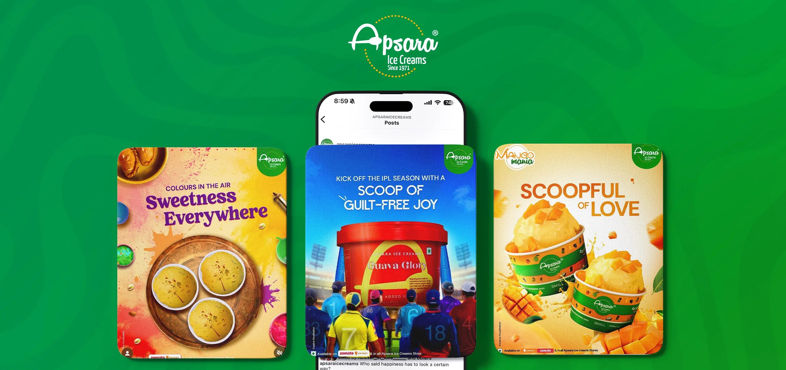
Your Tech Solution partner

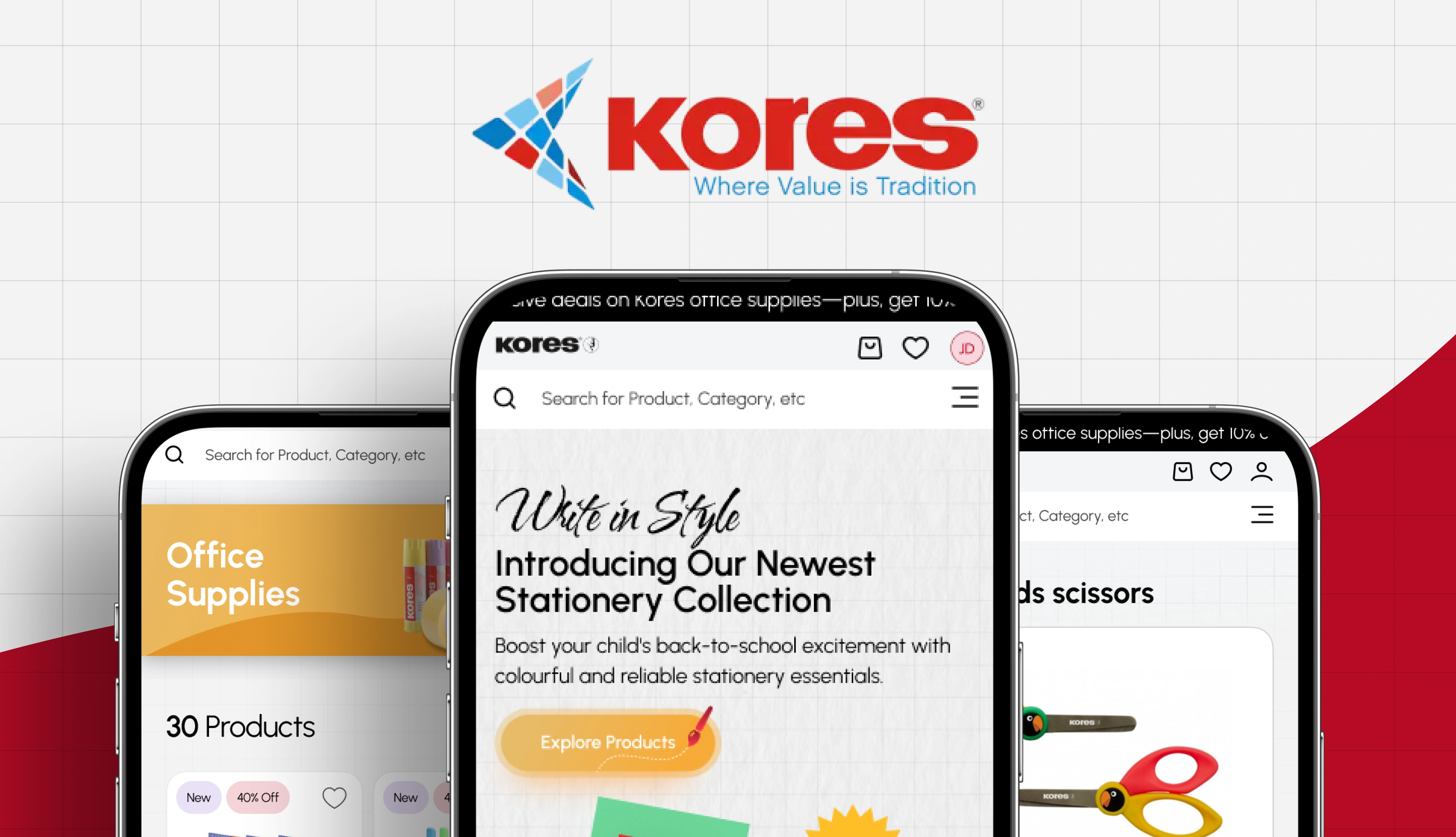
AI & Automation
Your UX/UI partner
Your Creative & Branding partner
Your Tech Solution partner
AI & Automation
Services
Your UX/UI partner
Your Creative & Branding partner
Your Tech Solution partner
AI & Automation
Your UX/UI partner
Your Creative & Branding partner
Your Tech Solution partner
AI & Automation
Your UX/UI partner
Your Creative & Branding partner
Your Tech Solution partner
AI & Automation
Your UX/UI partner
Your Creative & Branding partner
Your Tech Solution partner
AI & Automation
Your UX/UI partner
Your Creative & Branding partner
Your Tech Solution partner
AI & Automation
Your UX/UI partner
Your Creative & Branding partner
Your Tech Solution partner
AI & Automation